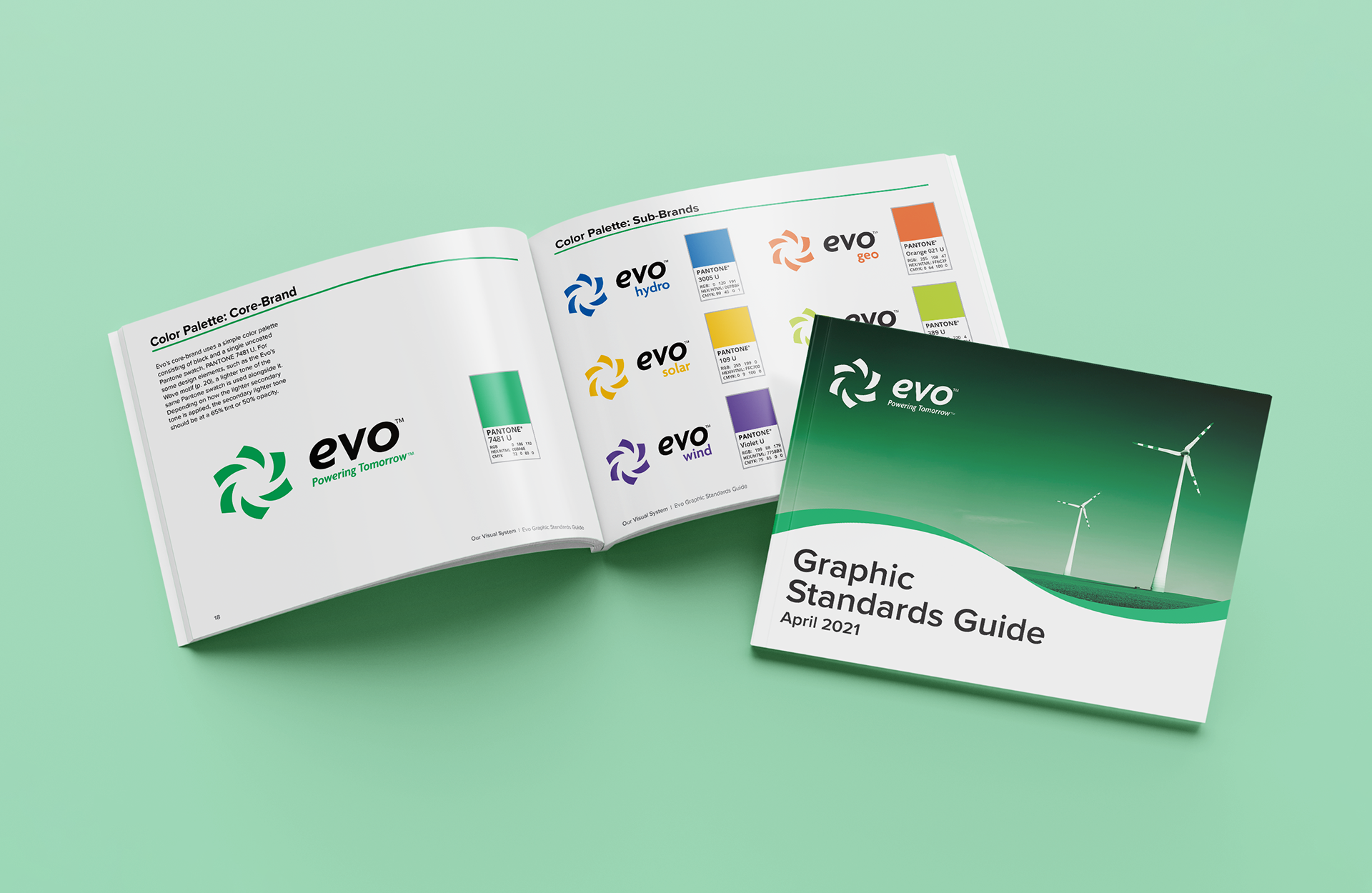
The goal of this case study was to develop a cohesive brand system for a conceptual renewable energy company, Evo. This involved designing Evo's logo, overall visual identity, and graphic solutions including stationery, digital advertisements, and marketing ephemera. To formalize the brand system in all its parts, I produced a graphic standards guide which extensively outlines the brand usage guidelines and defines the organizations’s values, voice, and overall style.
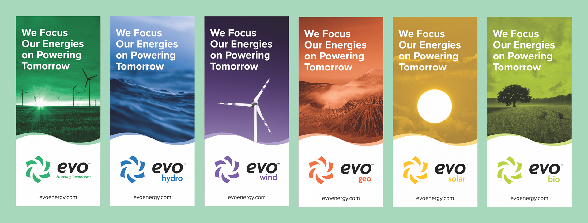
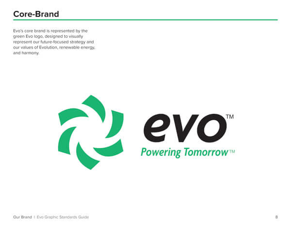
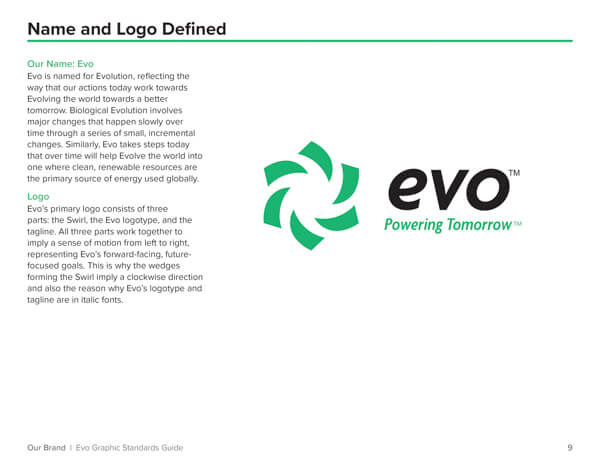
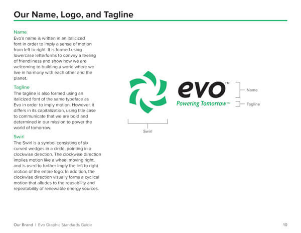
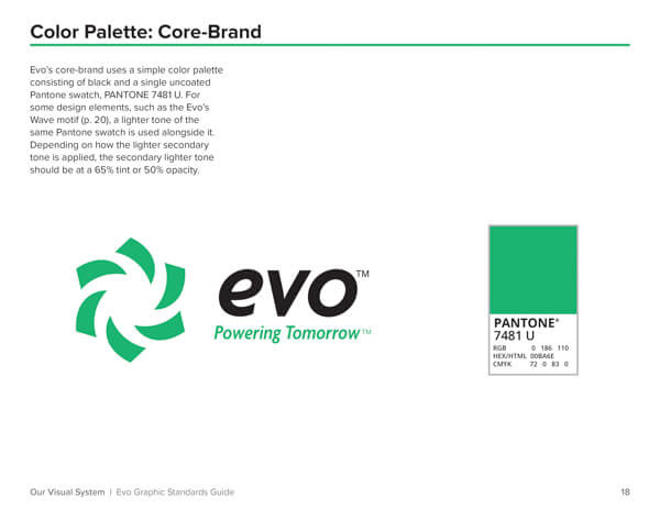
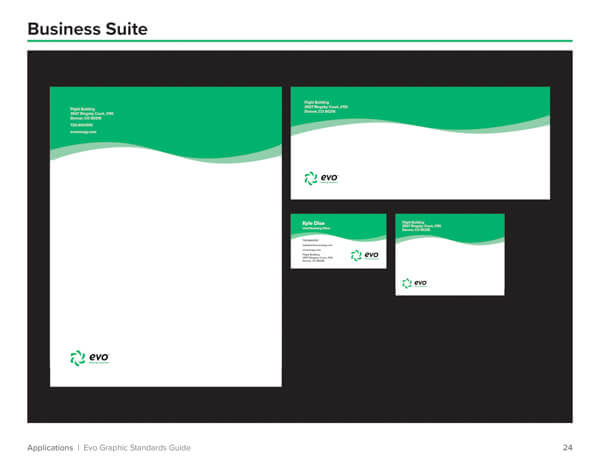
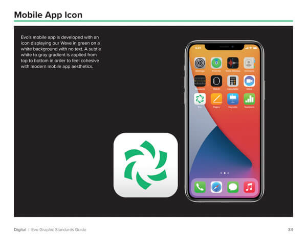
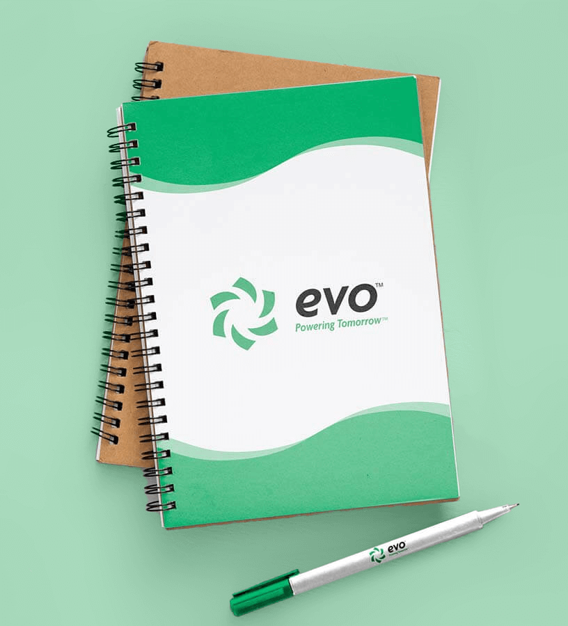
The first step was designing Evo’s logo, which aimed to be bright and welcoming while conveying a sense of motion through its swirl and italic type. Evo is a future-focused company whose tagline is “Powering Tomorrow,” so the implied motion of the logo flowed in a forward-facing direction to tie in their values. Next, designing a business suite provided the opportunity to decide how Evo’s identity would expand beyond its logo, and as a result, Evo’s Wave motif was created.
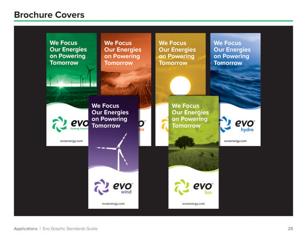
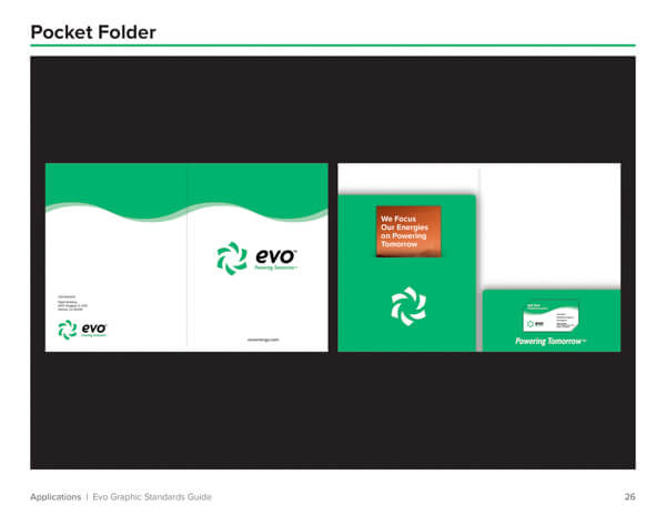
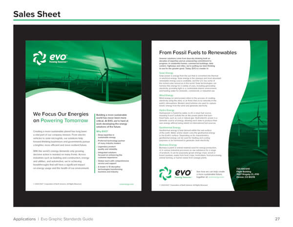
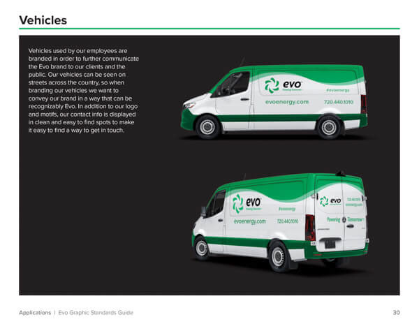
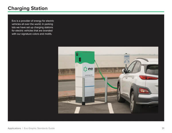
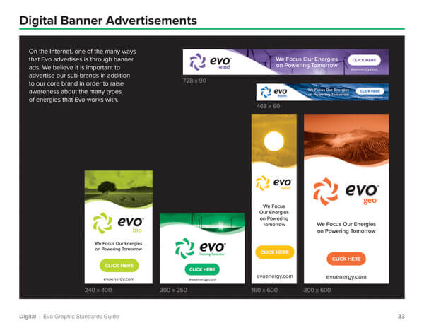
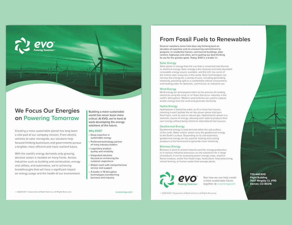
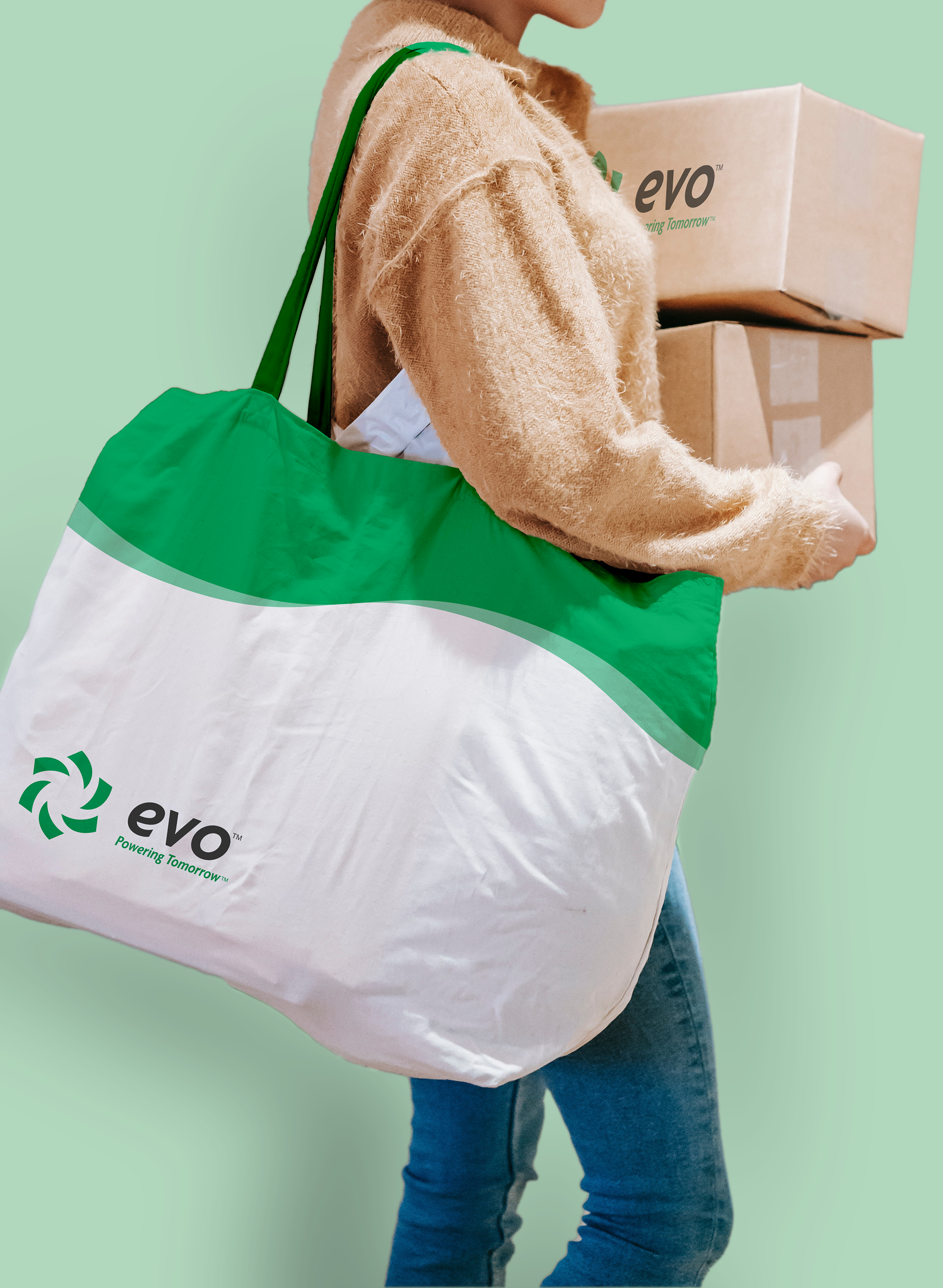
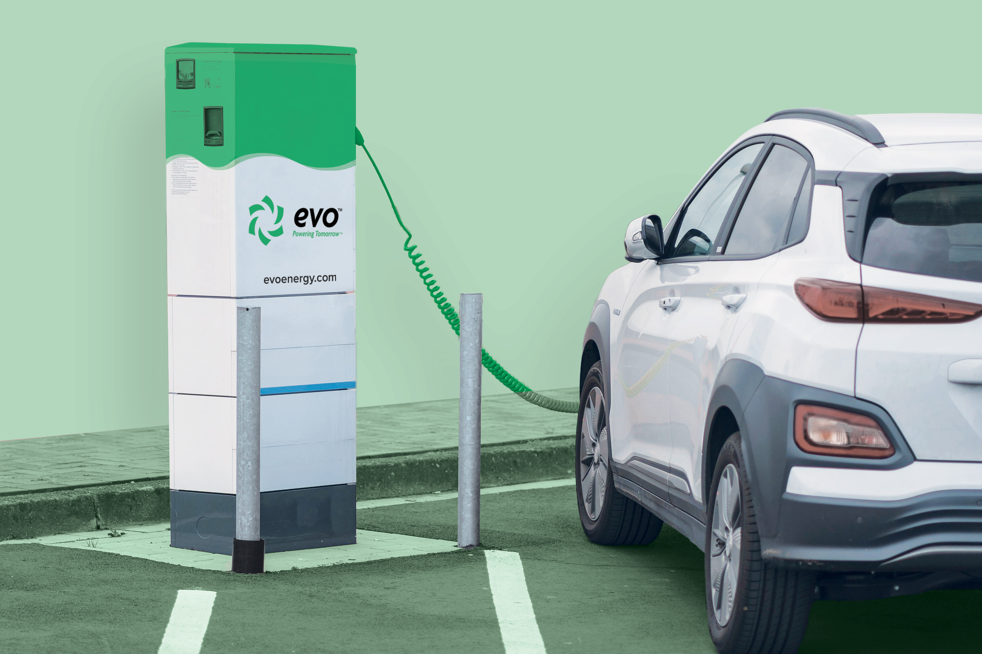
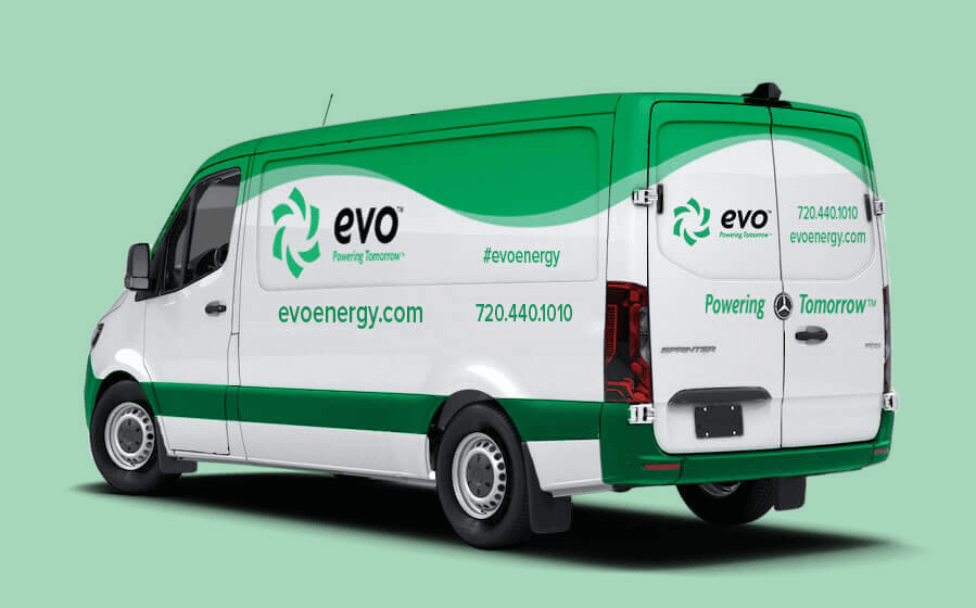
Now Evo had a solid foundation, and together the logo, colors, and motif would form the foundation for much of the rest of Evo’s visual identity. This would lead to the production of many more Evo-branded pieces, including brochures, a sales sheet, vehicle graphics, a charging station, and a handful of promotional items like tote bags and notebooks. Finally, everything would be tied together in an extensive 35-page graphic standards guide, outlining Evo’s voice, values and styles, specifying proper use of logos and motifs, and showcasing the various applications of Evo’s branding.
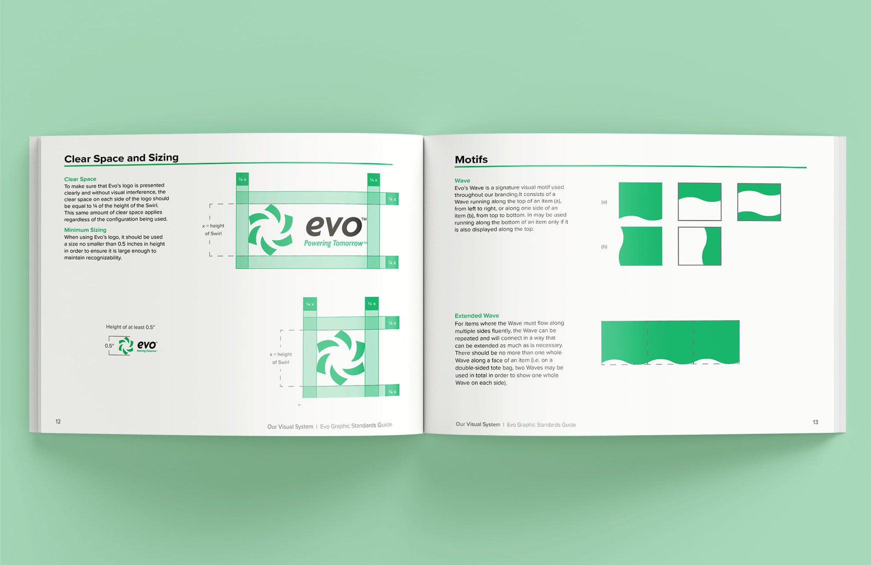
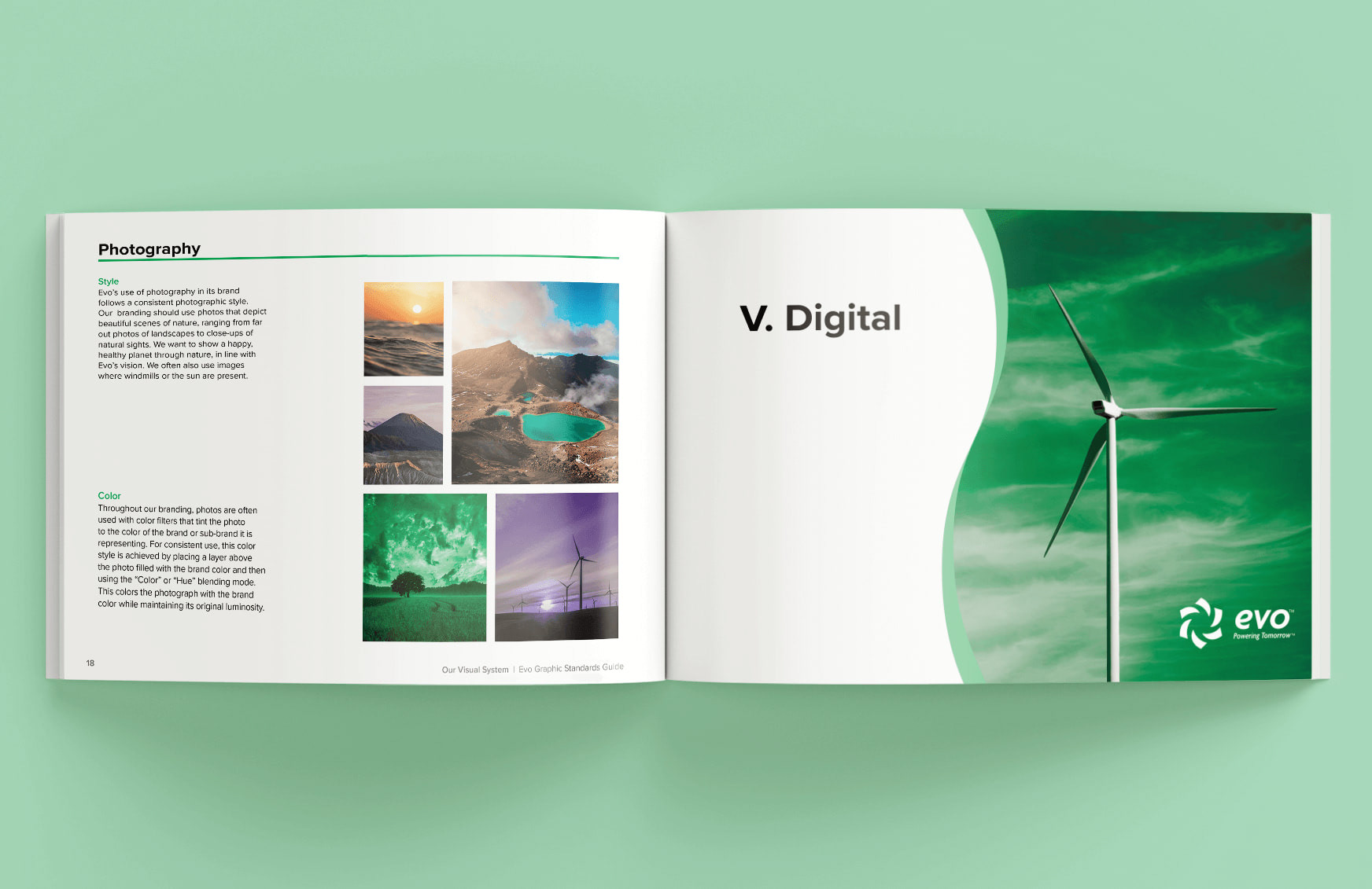
Graphic Standards Guide