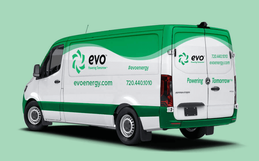
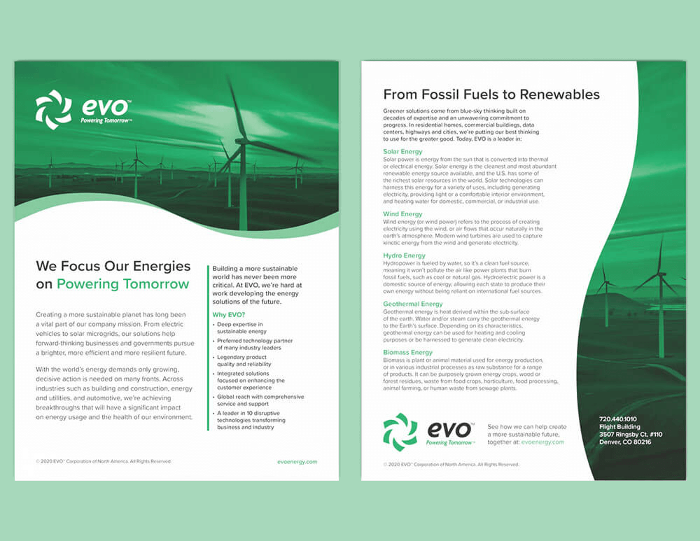
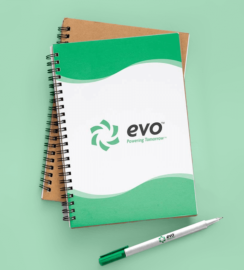
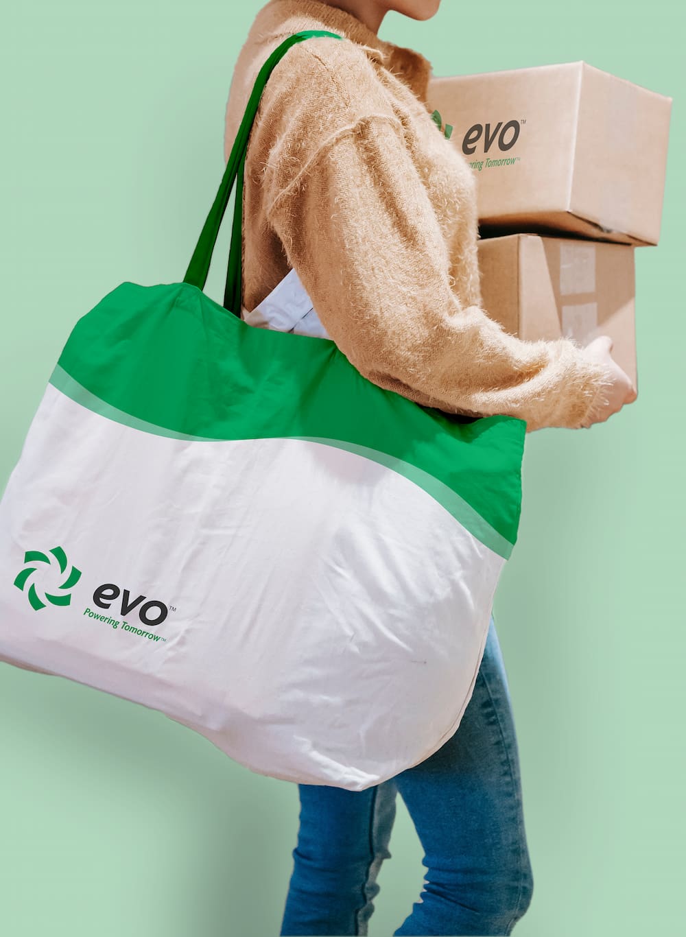
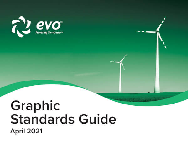
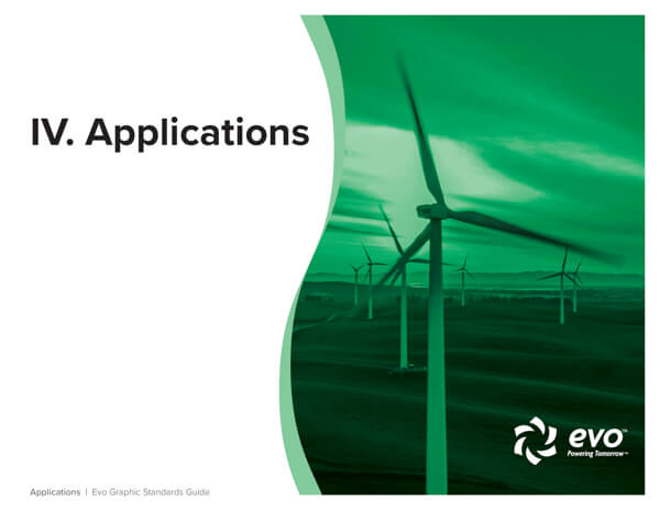
Evo is a multi-sector renewable energy brand concept built to express a transformational future-facing vision of renewable energy. Every touch point was carefully crafted to embody energy in motion and reflect Evo’s mission: Powering Tomorrow.
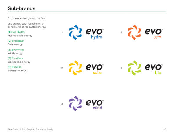
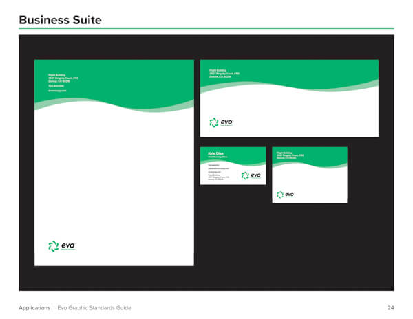
More than just a brand design, Evo’s deep-rooted principles and wide-reaching mission necessitated a brand system that adapts their identity across industries and platforms.
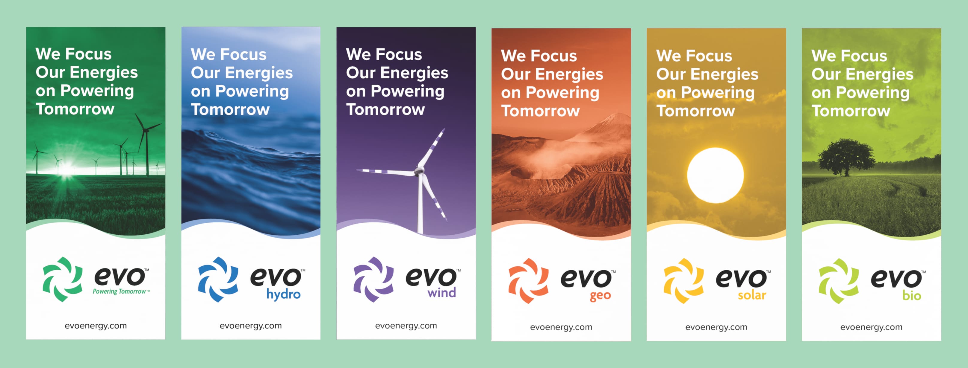
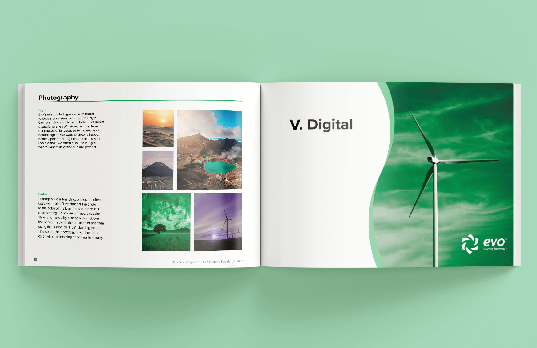
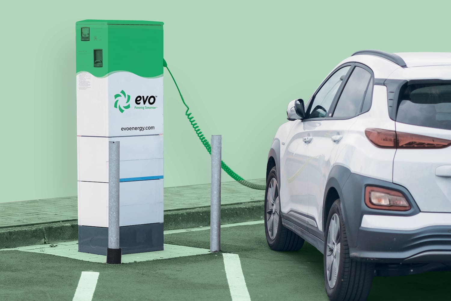
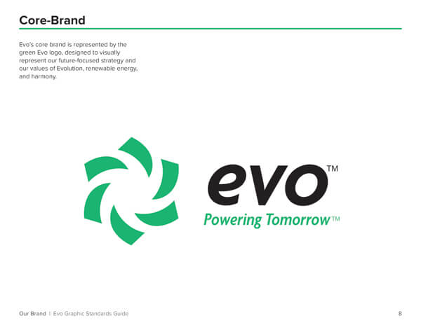
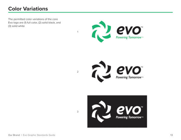
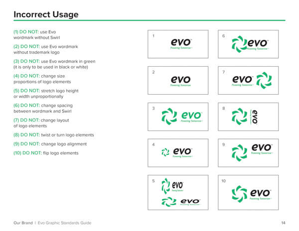
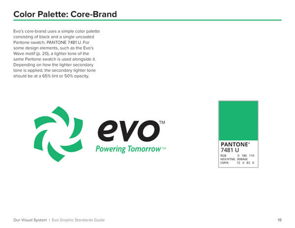
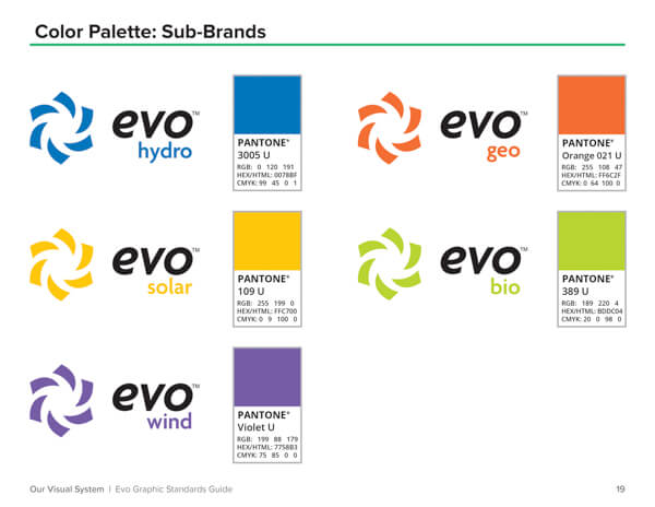
Logo: Forward-facing and welcoming, a mark that integrates naturally into the world with a sense of trust and wellbeing. The Swirl mark is one of visual movement that emblematizes renewable energy sources like the sun, wind turbines, and waves, while Evo’s wordmark uses forward-slanted type in a friendly and polished way.
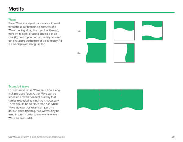
Wave Motif: Establishing continuity across platforms, consistency throughout its presence, tying touch points together both visually and and conceptually to Evo’s core principles.
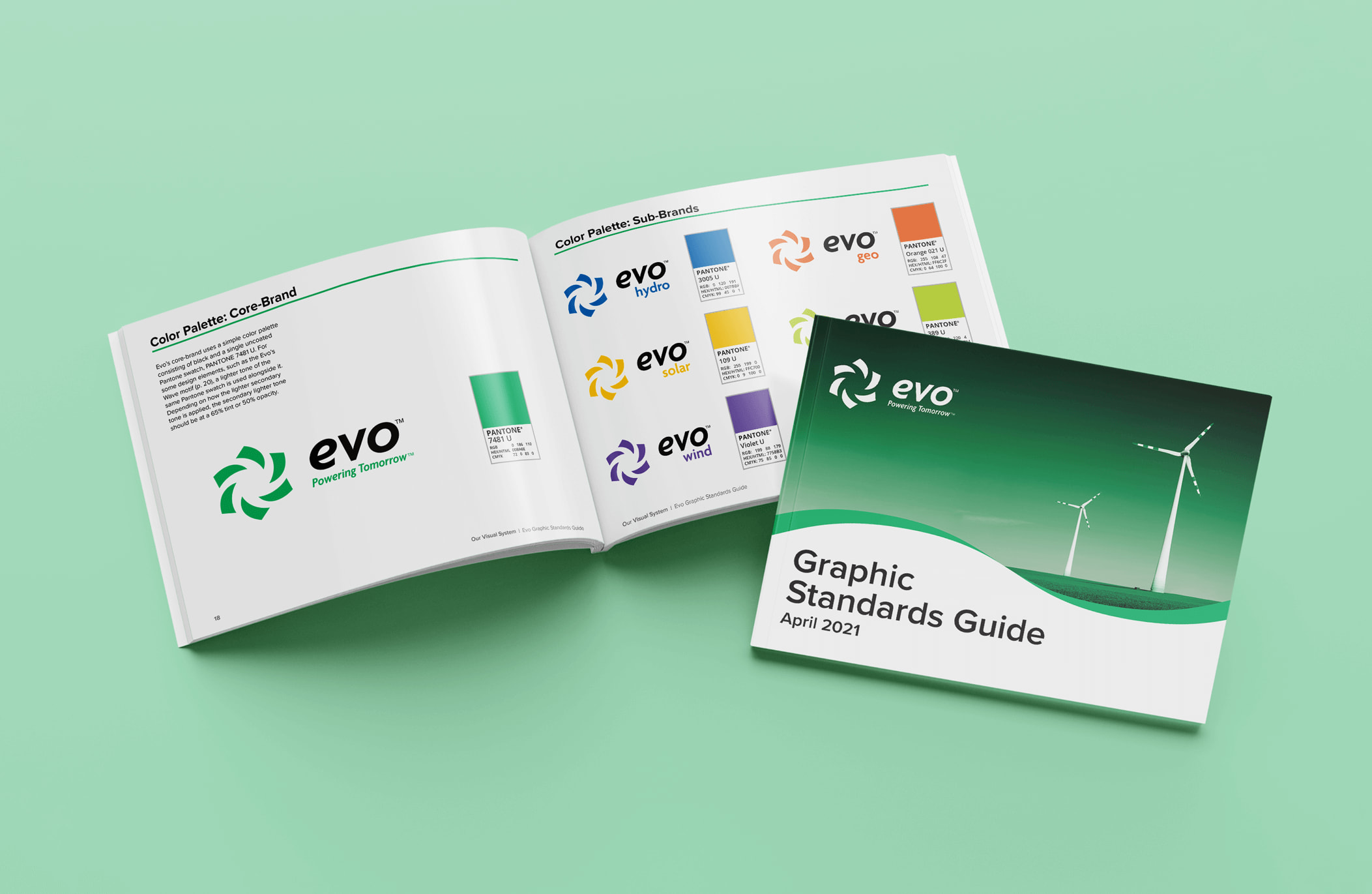
Founding principles were throroughly considered at every step, from defining the brand voice to designing collateral. My work to bring Evo to life is ultimately contained in the Evo Graphics Standards Guide, a 34-page handbook defining the Evo brand.